Abstract
In Informix 4GL, the way in which data appears on the screen is pretty much set in concrete; all manner of attributes are available, but are hard coded in the form file. However, the data presentation in Genero is a lot more dynamic – most of the attributes can be altered in the code, as and when you want. And because it is a modern GUI, there are more field types, layout options and widgets.
This article looks at 7 data presentation enhancements:
- Highlighting form elements dynamically
- Hiding and revealing form elements dynamically
- Using new GUI widgets
- Additional functionality for ‘tables’
- Dragging and dropping data from and into form elements
- Using a tree view
- Incorporating web components
Content
The user interface is managed differently in Informix 4GL and Genero. In Informix 4GL all the user interaction is handled transparently by the compiled code, whereas in Genero it is controlled via an “abstract user interface” (AUI) tree, which is in XML format. This is created when the program starts and is passed to the front end, which then renders it as real graphical objects on the workstation. The back end and front end trees are automatically synchronized as part of any interaction statement in the application. This AUI tree can be viewed and manipulated at runtime using built-in utilities, as in the majority of the code examples below, and it can also be resynced at any other time, e.g. during non-interactive sections of the code. Because of the tree structure, the AUI utilities are object oriented, but you don’t have to do any OOP.
In the example code for section 1 below
- LET w = ui.Window.getCurrent()
- Returns the object corresponding to the current window
- LET f = w.getForm()
- Returns the object corresponding to the active form in that window
- LET dn = f.getNode()
- Returns the full structure object corresponding to that form
- LET nl1 = dn.selectByTagName(“Label”)
- Returns a list (in an array) of all ‘Label’ fields in that structure object
- LET dn2 = nl1.item(li_count)
- ‘dn2’ is now the object for the field in question
- LET lc_name = dn2.getAttributeString(“tag”,””)
- Returns the value of the ‘tag’ attribute for that field
- CALL dn2.setAttribute(“color”, “black”)
- For that field, sets the value of attribute ‘color’ to ‘black’, and this change to the AUI tree on the back end will be sent to the front end as soon as the next interactive statement is executed
- Highlighting form elements dynamically
The ability to highlight form elements allows us to emphasize a specific field or form element visually to the user.
For a simple header/detail application (e.g. orders) the standard was a form with fields for the header e.g. top level order information, and an input array for the order lines. But if the order line has a lot of fields then this is not very workable.
A solution in Genero is a form which has the following –
- Fields for the order header
- A page for the detail fields
- A page with a table listing all detail lines for the order
- A toolbar with a ‘Details’ button
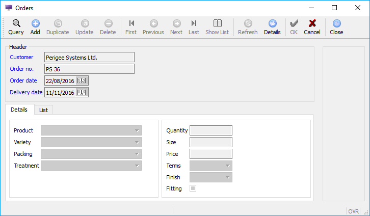
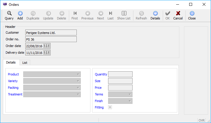
In this example, when the dialog starts, it is the header section which is active, but by clicking on ‘Details’, the code moves on to a DIALOG (see Handling Concurrent Data Inputs and Displays in Genero) for the details part of the form – in that code the ‘Close’ button returns focus to the header section. It would make this more user friendly (and efficient) if there was a very clear indication of which part of the form was currently active.
Genero have added the ‘tag’ attribute to every field type –
- set that attribute to one value (anything you like) for all the labels in the header section and a different value for those in the detail section.
- when switching between header and detail fetch a list of all the label fields.
- depending on the ‘tag’ value, change the label’s colour so that whichever is the active part of the form has, for instance, blue labels, and in the inactive section the labels are black.
‘Header’ section is currently active
‘Details’ section is currently active
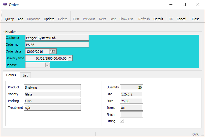
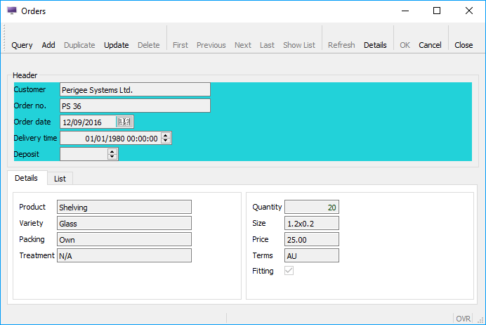
And there are plenty of other options; for instance, pretty much every type of form element has a ‘style’ attribute, and this too can be changed dynamically. So instead of changing the label colours you could use the ‘style’ attribute to change the background colour of the ‘grid’ the relevant fields are in, in almost exactly the same code as changing the label colours, as below with differences highlighted. And obviously you could do both.
‘Header’ section is currently active
Styles are defined in a ‘4st’ file in XML format, e.g. oninit.4st, which needs to be loaded before any windows are opened. Each style can have a variety of attributes, depending on for which field type that style has been created. The example below shows the definition of ‘hdrdet_active’, used in the example above – colours can be defined by a generic colour name or an RGB value, in hexadecimal.
- Hiding and revealing form elements dynamically
Another possibility is to completely hide fields, labels etc. dynamically. If for instance, in the screenshot above, the ‘Finish’ field is not applicable to certain products, once the product has been selected the ‘Finish’ field (and its label field) can be hidden or revealed, as appropriate. And when that happens the screen layout will be automatically re-aligned, so you don’t end up with a blank space in the middle of the active fields. This can be more user friendly than just disabling input for a field – often users will be wondering why a field is there but it cannot be accessed.
‘Finish’ field (and label) has been hidden
And this functionality can be applied to pretty much every field type, including page, group, grid and such like. So the ‘List’ page (as above) could be made visible only if there is more than one line in the order. If you have 2 tables and nothing else in a grid and you want to hide them both then it would be more practical to hide the grid – fewer lines of code and the screen will be dynamically re-aligned more appropriately.
In Genero one can have multiple input arrays active at the same time – see Handling Concurrent Data Inputs and Displays in Genero. In an application which we have written in Genero, there is a DIALOG with 8 INPUT ARRAY statements to allow the user to select options from separate categories for the product in the order line. This dialog is only executed if the product in question does have at least one category associated with it, but if, for instance, the product only has options from 3 categories, the 5 empty tables in the form are hidden. This means that you won’t have a large window showing multiple redundant input arrays, and that you don’t have to have separate sections of code depending on how many input arrays are needed.
- The data is loaded into a multidimensional dynamic array (another useful feature in Genero)
- o 1st dimension – order line
- o 2nd dimension – product (there can be 2 products per line)
- o 3rd dimension – category
- The corresponding element of the array ‘da_empty’ is initially set to TRUE for each ‘category dimension’ in the array, and if something is added to a category dimension then the corresponding element is set to FALSE
- In BEFORE DIALOG, for tables 1 through 8 in the form, if the corresponding element of ‘da_empty’ is still TRUE then that table is hidden:
You do not need to do anything in the INPUT ARRAY statements – if the table has been hidden it means that the INPUT ARRAY for that table will not be used.
Depending on circumstances, you may wish to hide and/or display different sets of fields; the same methodology can be used as in the sample code for Example 1, as ‘hidden’ is an attribute for all field types.
- Using new field types
You can now use modern GUI field types, such as SPINEDIT, PROGRESSBAR, SLIDER, COMBOBOX, RADIOGROUP and so on.
If the input for a certain field is a percentage, for instance, which should be between 0 and 100 and you only want 0%, 10%, 20% etc., then a SPINEDIT field is ideal. You can specify the MIN, MAX and STEP attributes, and the value moves up or down by the STEP amount when the user clicks on one of the arrows (or uses the up or down keys). Or the user can type in a value, but anything outside the specified MIN and MAX attributes will be rejected. SLIDER is very similar; you move the slider along a horizontal (or vertical) groove (with the mouse or keyboard) to select a value between the MIN and MAX attributes.
The PROGRESSBAR field type is useful for showing the user how the code is progressing through a non-interactive process, for instance when loading data into a temporary table from a very large flat file, and then doing updates per row. The example code below calculates 5% of the number of rows, and every time that quantity has been processed, the current percentage is displayed to the PROGRESSBAR field. Because this is not an interactive piece of code the ‘refresh’ method needs to be called to keep the display up to date.
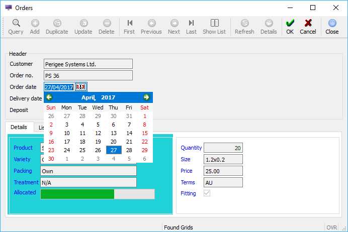
Another addition is the DATEEDIT field type which is very user friendly, as well as entering a date manually you can select it from a calendar – if you need to choose the date of the last Thursday in next April, for instance, the calendar will make it so much easier. The way the calendar is presented has some useful options – search ‘DateEdit style attributes’ in Genero Studio Help.
DATEEDIT Field
TIMEEDIT allows you to enter a time, either by typing or using the arrows, as with a SPINEDIT field. However, this is only for DATETIME HOUR TO SECOND fields.
DATETIMEEDIT is not a combination of the other two – it is a single SPINEDIT field, can only be used for DATETIME YEAR TO MINUTE or DATETIME YEAR TO SECOND fields, and is only available in Genero v3.0 with an appropriate front end e.g. GDC 3.0.
TEXTEDIT is a significant enhancement of the WORDWRAP feature in 4GL. It is specified in the form file pretty much as a WORDWRAP field, but has more functionality. If you include the attribute “STRETCH=BOTH”, when the user resizes the window that field will expand accordingly; you can restrict the expansion to only horizontal, vertical, or not at all; and if the amount of data entered exceeds the space in the field a scrollbar is automatically enabled. A TEXTEDIT field also supports spell checking, and you can specify the dictionary files via the ‘style’ attribute, so different fields could have different spell checking.
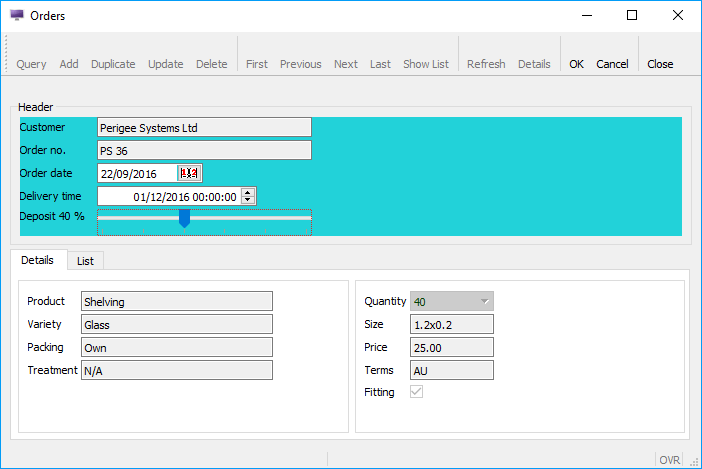
There is a new type of label, called a “form field label”. This field type is still a ‘label’, so it does not allow data entry, regardless of your code. However, it can be included in a DISPLAY statement, and its value will be formatted according to its FORMAT attribute, the table.column associated with it, or your code. And if it is included in an INPUT statement with the attribute UNBUFFERED, its display will be immediately updated whenever the associated program variable is altered; in the example below the ‘form field label’ shows the value of slider1 as the slider is being moved i.e. whilst the focus is still on that field, and ‘slider1’ is the only field in which you can enter data.
Form field Label – ‘Deposit 40 %’
- Additional functionality for tables
There is now a specific form field for use with DISPLAY ARRAY and INPUT ARRAY statements. TABLE is a container which defines the presentation of a list of records, bound to a screen array. As in Informix 4GL , the fields for the table are defined in the LAYOUT section, the column data types and properties are defined in the ATTRIBUTES section, and the4 association of the data to the screen array is specified in the INSTRUCTIONS section, but there are now many more options.
By default, a user can hide, move and resize columns, and choose which column is the sort order for the list. This is done solely at the front end by the user, and the next time the user runs the application (with the same front end on the same machine), the table will be in the same format. This will have no impact on the code, as it is just at the front end, but any or all of those can be disabled, using attributes of the TABLE container (UNHIDEABLECOLUMNS, UNMOVEABLECOLUMNS, UNSIZEABLECOLUMNS and UNSORTABLECOLUMNS).
The UNHIDEABLECOLUMNS attribute for the table container only applies to the front end – in the code, even with that attribute set, you can hide or display columns as required, using the setElementHidden method mentioned in section 2. If, for instance, you are listing the detail lines for an order, some columns may be irrelevant or mandatory, depending on the order’s status (e.g. pending, confirmed, invoiced).
You can create various different styles for tables, making them look and operate in different ways, and a style can have as many, or as few, of the attributes as you wish. There are many attributes which can be applied across the board, but the following relate only to the TABLE construct:
- different colours for odd and even rows, which makes it a lot easier to view a row in a table with many columns
- whether or not the current row (in an INPUT ARRAY) is highlighted
- the colour for the current row
- the colour of the text in the current row
- display as a grid i.e. with thin, pale lines between rows and columns, default is ‘yes’ for INPUT ARRAY, ‘no’ for DISPLAY ARRAY
- freeze columns, so that when scrolling to the left or right, the specified number of columns (starting from the left and/or the right) will always be there
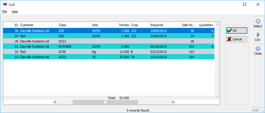
You can add aggregate fields at the foot of any appropriate column. This field will be automatically calculated and displayed, and there are several options for the calculation (AGGREGATETYPE) – SUM, AVG, MIN, MAX, COUNT, and if you want to do the calculation yourself, PROGRAM, but you will have to use a DISPLAY statement to show your calculated value. Another option is to have the aggregate field(s) either at the bottom of the list, in which case you may have to scroll down to see it, or at the bottom of the table on the screen, i.e. just above where you would see the scroll bar, which will make it continuously visible, regardless of how many lines are in the list. The screen shot below has 2 frozen columns on the left and right, and you can see that the scroll bar does only cover the middle of the table. The ‘Tonnes’ column has an aggregate field at the bottom of the TABLE container, and that field is kept aligned with the column when any scrolling occurs.
Frozen columns, and ‘anchored’ aggregate field
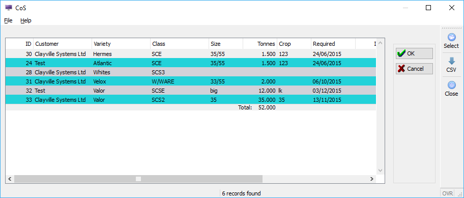
Simply changing a few lines in the ‘style’ file – no code change required, but you can change the style dynamically – results in a table with no frozen columns, and the aggregate field at the bottom of the list of the list.
No frozen columns, and default position for aggregate field
- Dragging and dropping data from and into form elements
There could be many uses for drag and drop, e.g., if you have a job list scheduled by date, and you want to be able to shuffle things around, you can have several concurrent display arrays on the screen which list next week’s schedule by day, and drag and drop an element from one array to another, rather than having to delete and recreate each job. This functionality also allows you to drag an element to a different position in its list.
However, in the DISPLAY ARRAY sub-dialogs within the DIALOG you do have to use the appropriate interaction blocks, and tailor them to meet your requirements. For instance, if you don’t want to be able to rearrange a list, you can compare the drag source and drop target and if they are the same disable the operation – highlighted below.
As well as doing this all in one DIALOG, you can also drag and drop between separate executables, and to or from another desktop application, assuming that it too supports drag and drop. In both these scenarios you will have to do a bit more to manage the data you are sending, or which is arriving. For the former, you need to use the setMimeType method to specify what sort of data it is, and setBuffer to make the data available; for the latter, it’s selectMimeType and getBuffer. If you are using drag and drop solely for internal purposes, it is recommended that you use setMimeType to a unique value in ON DRAG_START, and in ON DRAG_ENTER use selectMimeType to confirm that it is set to that value, and if not disable the drop.
This could require a fair amount of code, especially if in one dialog you are allowing both internal and external drag and drop, but it does work and it gives you complete control.
- Using a tree view
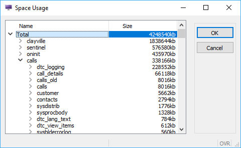
Tree view is a structure, used in many GUI desktop applications, to display hierarchical data. For instance, to show database space usage, the top element displays the total size; expanding that element (click on the right arrow) lists by database; choosing a database then shows a summary by table; expanding tables will summarise by data and index; choosing one of those could then list extents, for instance. And a tree structure can have many more levels than just those.
Tree View
This is managed by a ‘tree’ field in the form, which is quite similar to a ‘table’, and a normal program array and DISPLAY ARRAY in the code.
This can be implemented in 2 ways – either ‘static’, building the entire structure before the DISPLAY ARRAY is started, or ‘dynamic’ i.e. when a node is expanded, extract the data and append the child nodes, and when one is collapsed, delete the child nodes so a subsequent expand process doesn’t create duplicates. When a user clicks a “>” icon, it triggers the ON EXPAND interaction block in the DISPLAY ARRAY, and ON COLLAPSE is triggered by clicking the down arrow. If your data is quite dynamic i.e. it’s likely to have been updated since the DISPLAY ARRAY was invoked, then the latter is the recommendation; otherwise, when expanding a node, you may not have the latest information. Also, if the tree structure is extremely large, loading it dynamically will be more user friendly.
When a node is created, if it does have child data then the ‘hasChildren’ field for that element in the program array is set to TRUE, which will display the ‘expand’ icon. Otherwise it should be set to FALSE so no icon is shown.
As always in Genero, there are a variety of options – you can customise the “expand” and “collapse” icons, define an action for when a field is double clicked, disable column sorting and so on. And the full drag and drop functionality is also available in a tree view, using the same interactive control blocks as mentioned above.
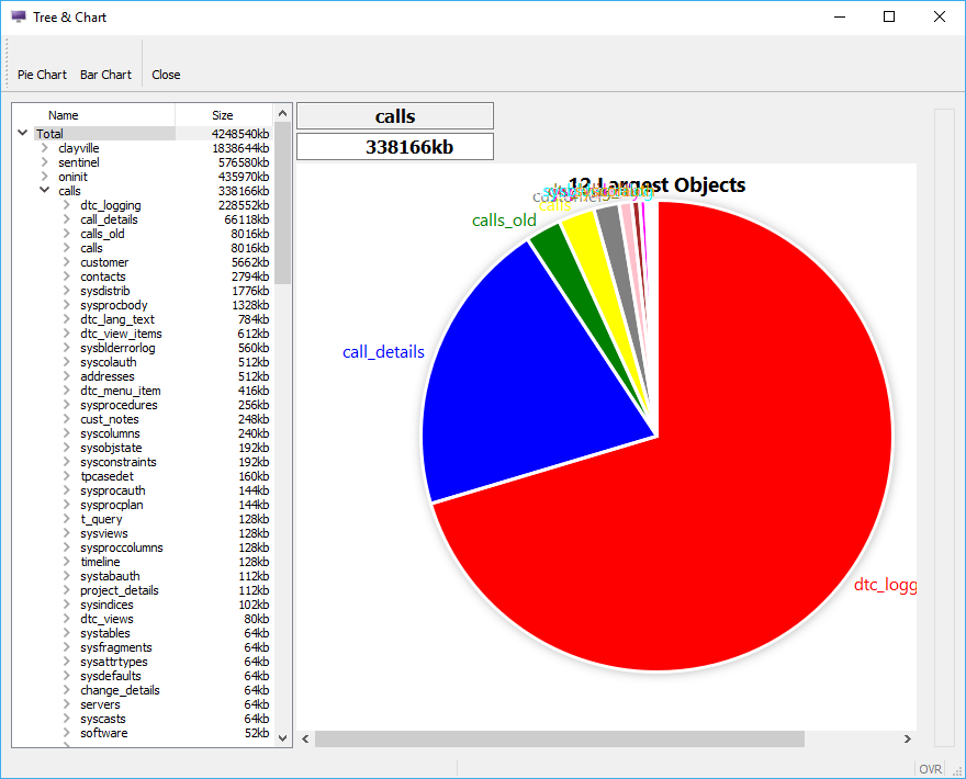
- Incorporating web components
This is another new field type, and is designed for implementing external graphical components. These components can be very useful, to display graphs and charts, maps with a highlighted location, drawing tools, and so on. And because this is a component within a Genero form, activated in a DIALOG, it can be dynamically updated, so as you are changing the content of another field the graph (or whatever) will be changing simultaneously. The reverse can also be done; clicking a graphic can return a value back to your code.
In the tree view example above, you can include a web component field for a pie chart in the form – this field includes an attribute which holds the data for the pie chart. When a node is expanded in the tree view, that attribute can be updated which will cause the chart itself to be immediately redisplayed.
Web Component – dynamic display of Pie Chart
There are 2 techniques – a third party service accessed via a URL, or code (third party or yours) executed locally. If the latter then that code has to be on the front end, i.e. the user’s workstation, when using GDC, or the backend when using GWC.
Caveats
Some of the functionality described above may vary depending on which front end is being used. For instance, when using GDC dragging a SLIDER will move the value up or down by 1 at a time, but a web browser is less sophisticated, and a slider will only move a STEP at a time. And as mentioned for the DATETIMEEDIT field, some of the latest features may require the latest version of GDC.
Disclaimer
Suggestions above are provided “as is” without warranty of any kind, either express or implied, including without limitation any implied warranties of condition, uninterrupted use, merchantability, fitness for a particular purpose, or non-infringement.
Contact us
If you have any questions regarding data presentation in Genero and would like to find out more, simply contact us.